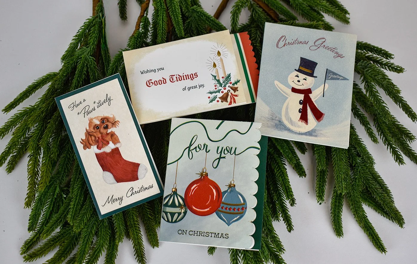
Vintage Christmas Cards
This series of Christmas cards was inspired by the expressive and decorative design styles of the 1940s and 1950s. The project aimed to revive the nostalgic charm of mid-century holiday cards, with a particular focus on the typography, layout, and illustrative flourishes that defined the era.
As part of the visual research, I acquired physical artifacts of authentic vintage Christmas cards to study their materials, type treatments, and design details firsthand. This hands-on approach informed every aspect of the project, from the type choices to the finishing touches. The designs feature a range of expressive lettering styles including ornate scripts, playful sans serifs, and hand-drawn letterforms arranged in lively, era-appropriate compositions.
Each card includes seasonal illustrations such as candles, a snowman, Christmas baubles, and a dog, all rendered in a style reminiscent of the period. The traditional color palette of reds, greens, creams, and golds evokes a sense of warmth and nostalgia. After printing, I added finishing touches to all of the cards by hand using gold foiling and glitter to replicate the tactile charm and production techniques commonly seen in vintage holiday stationery.
This project not only highlights the historical significance of decorative typography and holiday design but also invites a broader appreciation for craftsmanship and visual storytelling. It serves as a celebration of expressive type and the enduring emotional resonance of handmade holiday traditions.


Pattern Collection
This series of five seamless patterns was created as part of a larger exploration of Christmas-themed surface design. Each pattern began with hand-drawn elements in Procreate, allowing for an organic, illustrative feel. These drawings were then refined and arranged into repeat patterns in Adobe Illustrator, ensuring seamless repetition and versatility across various applications.
Each design reflects a different facet of the holiday season:
Skiers on a Hill features a playful winter scene with skiers gliding down snowy slopes, capturing the energy and movement of outdoor holiday fun.
Williamsburg-Inspired is a rich, historical pattern filled with illustrated fruits and nuts, inspired by traditional Colonial Williamsburg Christmas decor.
Pink Poinsettia offers a softer, more romantic take on holiday florals, with lush pink poinsettias arranged in a festive yet unexpected palette.
Gingham and Star includes a cozy gingham base layered with star motifs, blending rustic charm with a celestial nod to the Christmas story.
Classic Christmas presents a timeless composition featuring vintage-inspired Christmas baubles and holly leaves, evoking a nostalgic and cheerful holiday spirit.
Each pattern brings a unique aesthetic to the series, ranging from whimsical to elegant. Together, they demonstrate a balance between illustrative detail and thoughtful layout, celebrating the season through color, texture, and storytelling.
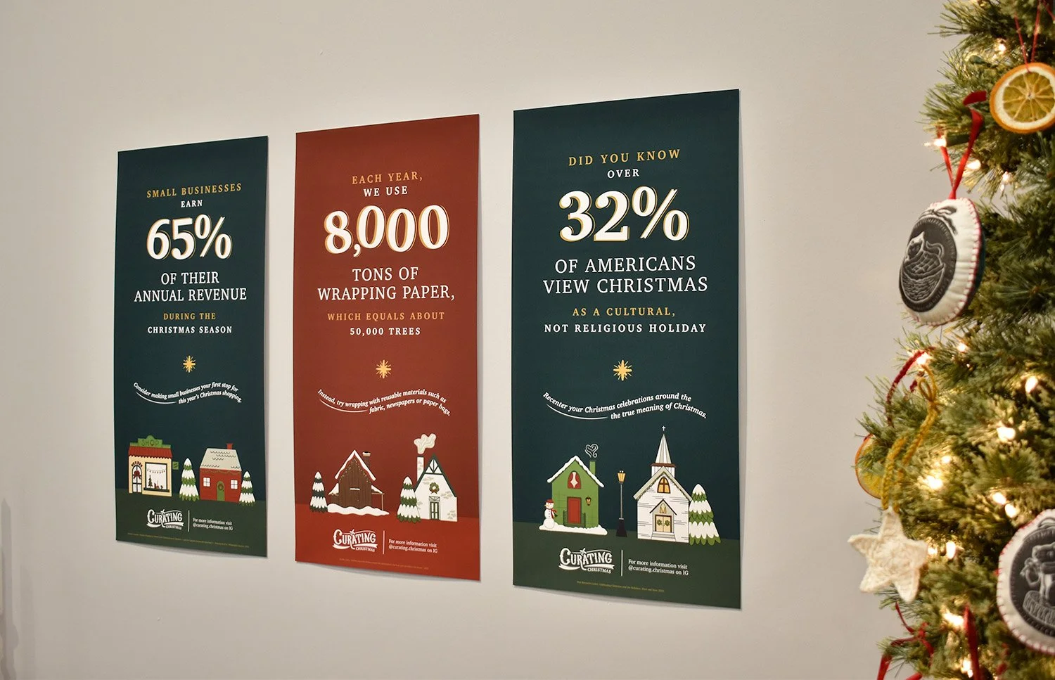
Poster Series
This poster series was created as a companion to the Curating Christmas brand, with the specific goal of grounding the visual experience in real-world context. While much of the brand leans into charm and nostalgia, the posters serve as a visual reminder that the beauty of the holiday season exists alongside serious challenges. Each poster highlights one of the three primary areas impacted by overconsumerism: economic, environmental, and religious or cultural values.
To communicate these ideas clearly and powerfully, I selected three impactful quotes and statistics, each corresponding to a key area of concern. The first quote, from The Philadelphia Inquirer, reveals how much small businesses rely on holiday spending, emphasizing that consumerism can have a positive effect when redirected toward local makers and artists. The second quote, from ABC News, quantifies the environmental toll of disposable wrapping paper, offering a lead-in to one of my visual solutions: reusable fabric wrap and repurposed paper packaging. The third quote, from Pew Research Center, illustrates the shift away from Christmas’s religious roots, speaking to a cultural detachment that inspired my desire to create more meaningful family traditions through this project.
The posters feature large, tilted numerical figures that add a sense of motion and visual interest. This typographic treatment, paired with hand-drawn illustrations and rich, dark backgrounds, helps each poster stand out while reinforcing the seriousness of the message.

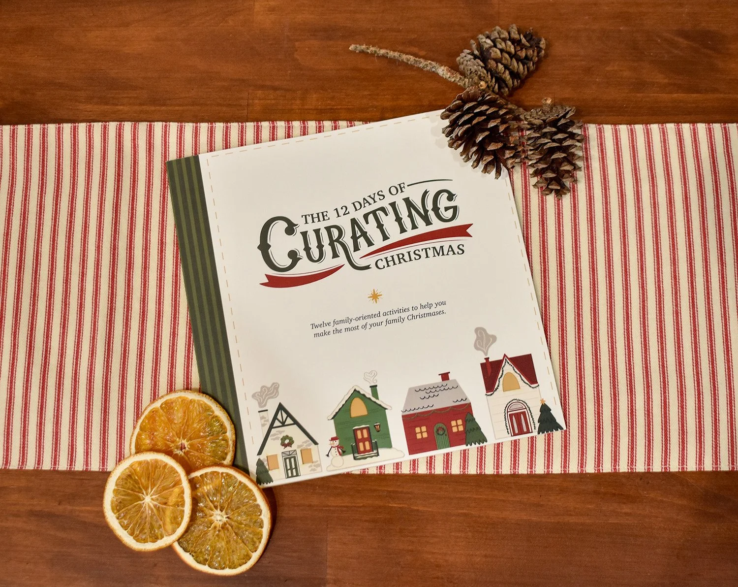
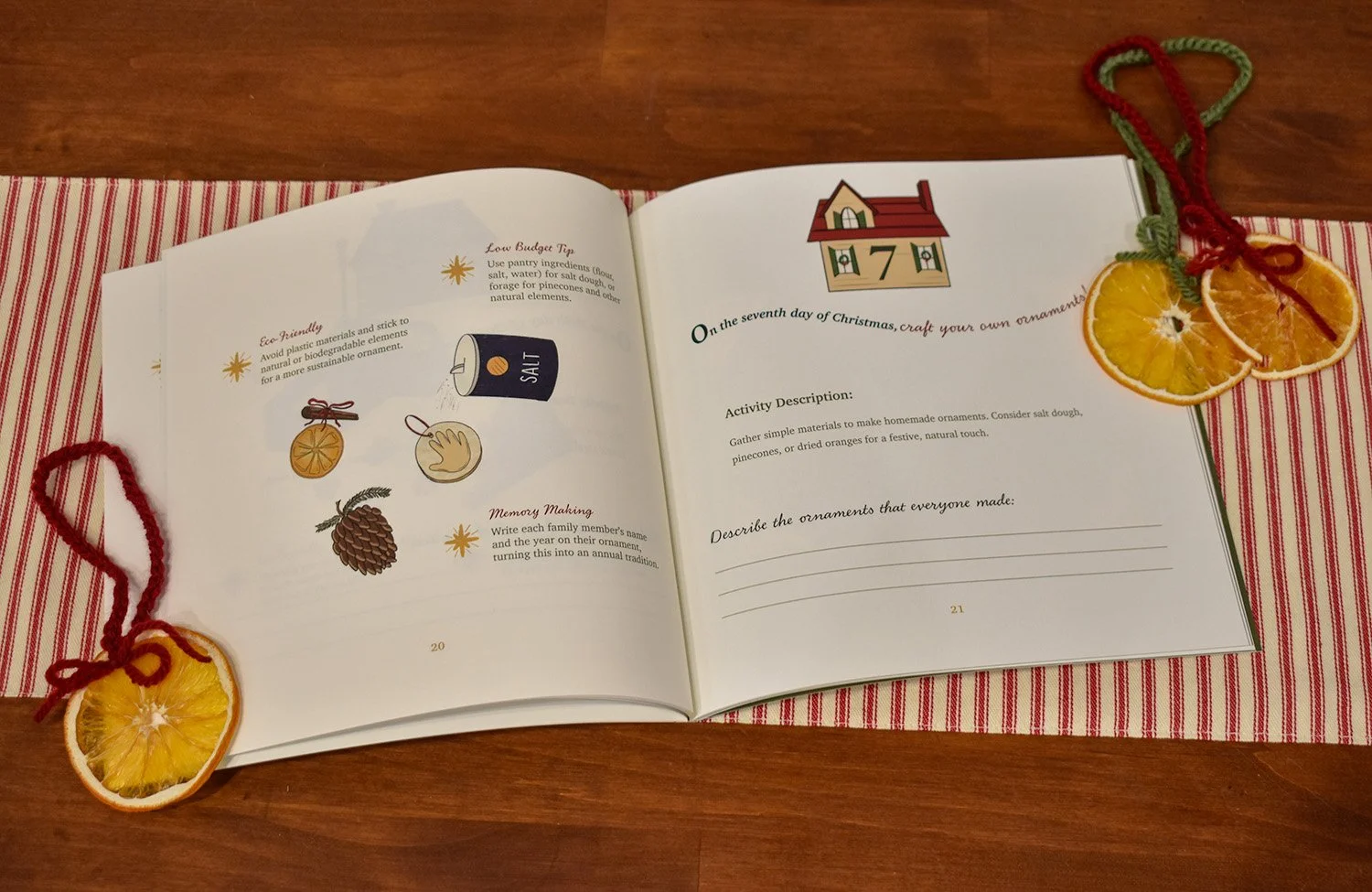
Curating Christmas Family Guide
The Curating Christmas Family Guide is a 40-page interactive publication designed to help families celebrate the holiday season in a more intentional, meaningful way. As a key piece of the Curating Christmas brand, the guide offers an alternative to the excess and stress of overconsumption by focusing on shared experiences, creativity, and connection.
The guide is structured around The 12 Days of Curating Christmas, with each spread presenting a simple, low-cost activity that families can complete together. These activities are designed to reduce environmental impact and foster lasting memories. Many of the ideas were inspired by personal traditions, suggestions from friends and professors, and thoughtfully adapted from online sources to ensure they were fun and practical.
Visually, the guide reflects a careful balance between handmade warmth and organization. All illustrations were created by hand to add personality and a sense of whimsy. The type treatment includes curved text elements that echo the brand’s logo, adding movement and a playful tone to the layouts.
Later in the design process, several additional spreads were added to provide step-by-step instructions for more DIY-focused activities. These expanded the guide’s content and made it more accessible for families with a wide range of interests and skill levels.
The Curating Christmas Family Guide serves as both a joyful keepsake and a practical tool, encouraging families to slow down and savor the season through simple, shared experiences.
Papercut Christmas Card Series
This series of three Christmas cards was created using a combination of digital design and laser cutting technology, showcasing intricate papercut artistry. The cards were designed on a computer and then meticulously cut out on a Glowforge laser cutter. Each card in the series focuses on a distinct Christmas icon, celebrating the timeless symbols of the season through delicate, detailed designs.
The first card features a deer, a classic symbol of Christmas. The second card presents a warm mug of cocoa paired with mittens, evoking feelings of cozy comfort and winter warmth. The final design in the series showcases three Christmas ornaments, intricately arranged to reflect the festive spirit and joy of the season.
Each design was a product of careful planning and iterative trial and error, ensuring that the papercut details remained precise and the designs flowed seamlessly. The laser-cut technique allowed for intricate details that add depth and texture to the cards, transforming them into works of art that can be cherished year after year.
These papercut cards offer a unique, tactile approach to holiday greetings, combining the precision of modern technology with the timeless beauty of handcrafted design.


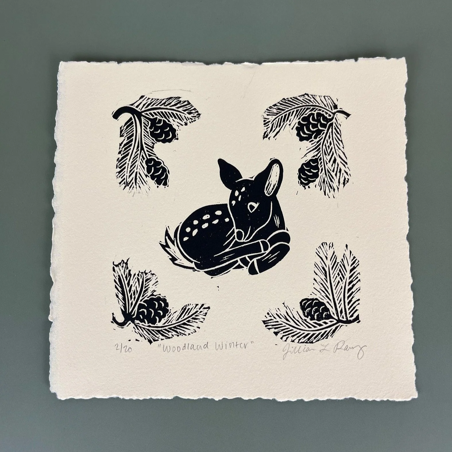
Assorted Prints
This collection of linocut prints showcases a process, driven blend of digital and traditional techniques. Each piece began as a sketch in Procreate, where I used my background in graphic design to refine composition, balance, and detail. From there, the designs were hand-carved into linoleum blocks and printed using traditional relief methods, blending the precision of graphic design with the tactile beauty of traditional art techniques. The result is a body of work that reflects both thoughtful planning and hands-on craftsmanship.

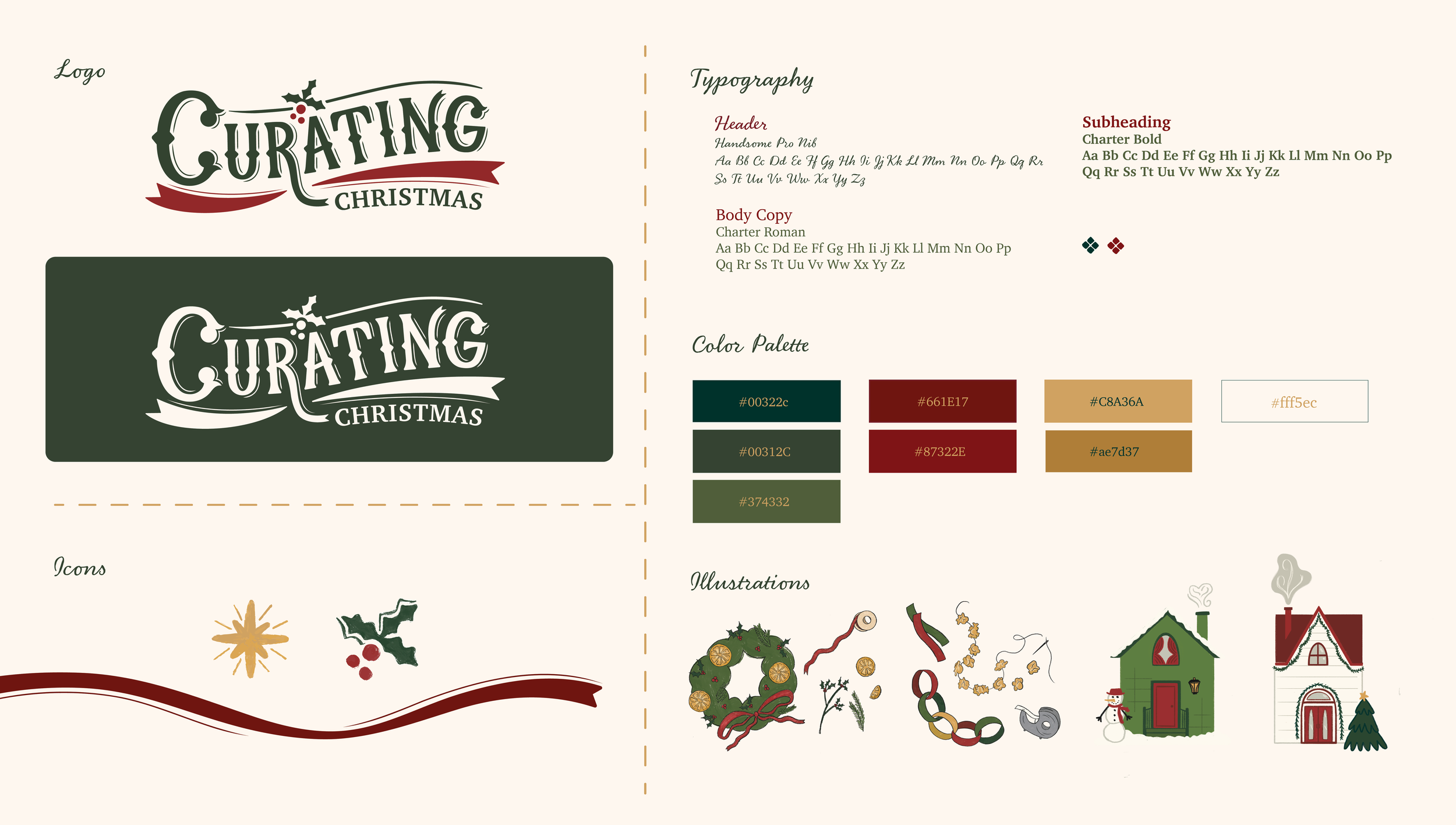
Curating Christmas Branding
Curating Christmas is a thoughtfully developed brand created during my MFA thesis, which explored solutions to the growing issue of overconsumerism during the holiday season. The brand celebrates simplicity, intention, and creativity by encouraging families to make meaningful memories through thrifted, handmade, and experience-based traditions.
The visual identity needed to be versatile enough to house a wide array of deliverables including event materials, signage, and an interactive family guide, while maintaining a cohesive and inviting aesthetic. Inspired by vintage hand-drawn logos, the branding evokes nostalgia and warmth. A jewel-toned color palette, drawn from classic mid-century Christmas decorations, reinforces the brand’s connection to treasured traditions and heirloom quality. The result is a flexible brand that works well in a variety of applications.


Quilted Signage & Handout
These two pieces, created under the Curating Christmas brand, reflect a shared mission of bringing warmth, intentionality, and handcrafted charm to the holiday season. The quilted signage, made using traditional sewing and quilting techniques, served as a tactile and welcoming visual centerpiece for the Curating Christmas experience. Accompanying it is a thoughtfully designed handout offering practical tips for thrifting a more curated, meaningful Christmas. It encourages readers to embrace secondhand finds and the practice of year-round shopping with purpose. Though distinct in form, both works blend handmade craftsmanship with graphic design sensibilities to communicate the heart of Curating Christmas: connection, preparation, and joy.
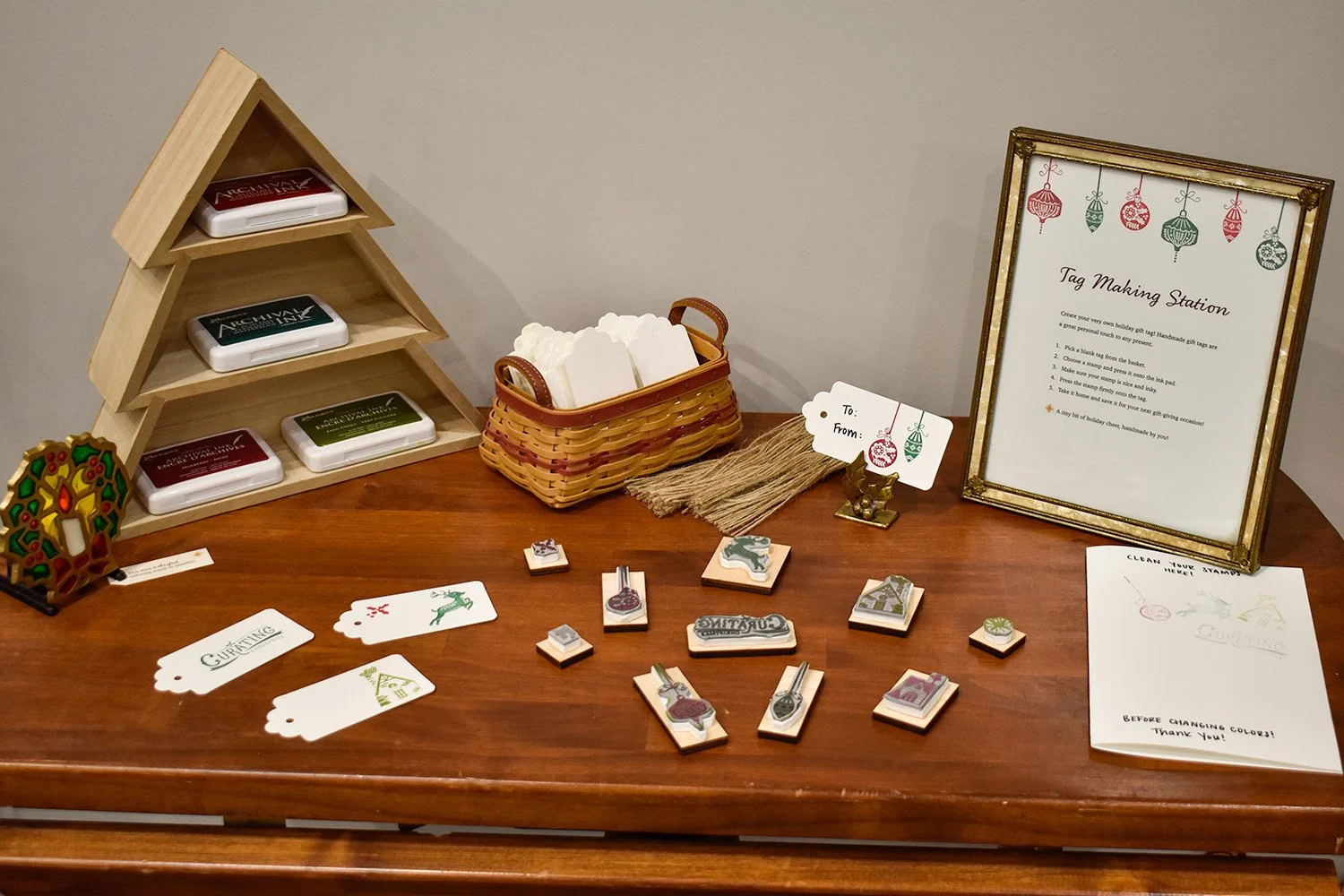
Laser Engraved Stamp Collection
This collection of 11 original stamps showcases my exploration of illustration, digital design, and laser engraving. Each stamp began as a hand-drawn sketch in Procreate, which I then vectorized in Adobe Illustrator and engraved into laser-safe rubber using our Glowforge laser engraver. The finished stamps are mounted on custom-cut wooden blocks, each engraved with a preview of the stamp’s design. This collection reflects my passion for blending craftsmanship with modern technology to create tactile, functional art.